
The style decides more than the theme does
When you design a ketubah on Diyo/Art, you make two big choices: what appears in the artwork (your theme) and how it's painted (the art style). Most couples agonize over the first and click the second almost at random — but the style is actually the stronger lever. The same pomegranates can feel airy and romantic, rich and dramatic, ancient and archaeological, or crisp and contemporary, depending entirely on which of the six styles renders them.
To show exactly what each style means, we generated all six of the images below from the identical theme — "pomegranates and olive branches" — changing nothing but the style button. What you see differing between them is purely what that choice does.
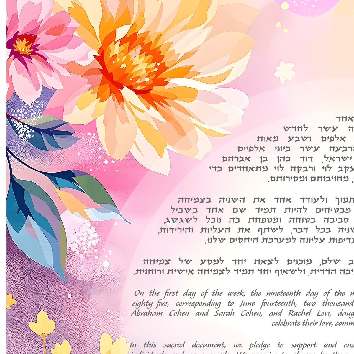
Watercolor — flowing artistic strokes

Watercolor is our most popular style, and the one to pick when you want the artwork to feel light. It renders your theme in transparent, flowing washes — bright, vivid color with soft bleeding edges, floating on clean white space. Petals stay delicate, stems stay loose, and nothing ever looks outlined or inked.
Choose it if you love garden weddings, botanical themes, and soft romance. It flatters florals, greenery, and natural scenes better than any other style, and its generous white space keeps the whole ketubah feeling calm around your text.
Oil — rich painted textures

Oil goes the opposite direction: thick, visible brushstrokes with real impasto texture and deeply saturated pigment. The pomegranates above look like you could touch the paint. Colors run rich and warm — burgundy, amber, deep emerald — and every element carries weight and shadow.
Choose it if you want drama and heirloom presence. Oil suits bold, classical subjects: sunflowers, irises, fruit, landscapes. If watercolor is a spring morning, oil is a candlelit dinner.
Mosaic — intricate tile patterns

Mosaic rebuilds your theme out of small flat stone tiles — tesserae — with visible grout lines between them, the way a Roman or Byzantine floor would. Every leaf and fruit becomes an arrangement of colored squares, which gives the design a wonderful structured, archaeological quality.
Choose it if you're drawn to history and to Israel — mosaic reads instantly as ancient Mediterranean, and it's a natural fit for themes like grapevines, stars, the seven species, or Jerusalem. Bold, clearly shaped motifs tile beautifully; wispy delicate ones don't, so keep your theme graphic.
Woodblock — bold carved block print

Woodblock is a flat ink print — like a hand-carved stamp pressed onto paper. There's no shading, no gradients, no 3D depth at all: just bold simplified shapes in a deliberately limited palette of two or three ink colors. The result has a warm folk-art honesty that none of the painted styles can imitate.
Choose it if you love folk traditions, paper-cut ketubahs, or Scandinavian and Eastern European design. It's the strongest graphic statement of the six, and it pairs especially well with birds, branches, and stylized botanical silhouettes.
Illuminated — ornate manuscript borders

Illuminated draws on the medieval manuscript tradition that produced history's most treasured ketubahs: dense scrollwork, intertwining vines, filigree flourishes, and ornament layered on ornament. Your theme gets woven through an elaborate border the way roses climb through the margins of an old prayer book.
Choose it if tradition itself is your aesthetic. Alongside a classical Aramaic text, an illuminated border makes the whole document feel like it was commissioned centuries ago — in the best way. It rewards themes with vines, leaves, and repeating motifs that can flow through scrollwork.
Modern — clean, minimal design

Modern strips everything back: clean shapes, flat contemporary color, and a lot of deliberate negative space. Notice how the pomegranates above became simple, confident forms — closer to a design poster than a painting. Of the six styles it puts the most visual emphasis on your text, because the artwork frames rather than competes.
Choose it if your wedding leans contemporary — city venue, minimal invitations, a house full of clean-lined furniture the ketubah will eventually hang in. Abstract themes, line art, and restrained palettes shine here.
How to actually choose
- Match the wall, not just the wedding. Your ketubah hangs in your home for decades. The style that fits your living room matters more than the one that fits your centerpieces.
- Let the theme and style agree. Soft florals want watercolor; geometric and folk motifs want mosaic or woodblock; vines and scrollwork want illuminated; abstract shapes want modern.
- Think about your text. Busy, ornate borders suit shorter traditional texts; minimal styles give longer English texts room to breathe.
- When in doubt, generate both. Designs take under a minute, so trying your theme in two or three styles costs nothing but curiosity.
Style is only one part of the decision, of course — our ketubah buyer's guide walks through the rest, from texts to sizing to print options.
See your own theme in all six
The fastest way to understand the styles is the way this post was made: keep your theme identical and switch only the style. Head to the create page, describe what you love — your flowers, your city, your story — and generate it in watercolor, then once more in modern or mosaic. The difference will tell you immediately which one is yours. And because every design is saved to your gallery, you can compare them side by side before you commit to a single brushstroke.